
rinu
rinu
rinu
rinu

rinu
rinu
rinu
rinu
rinu
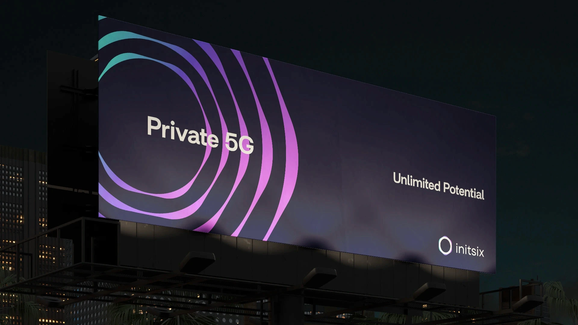
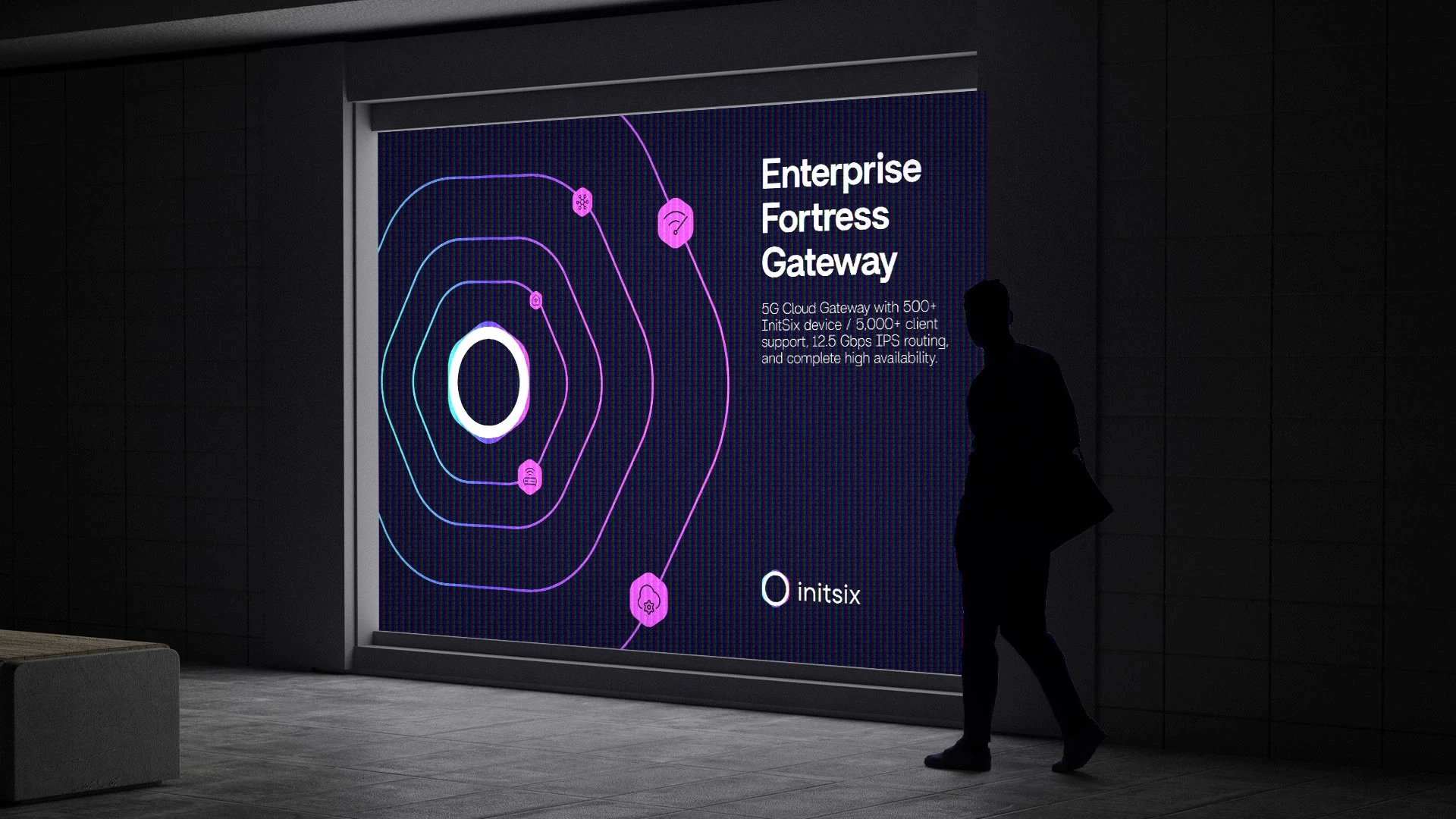
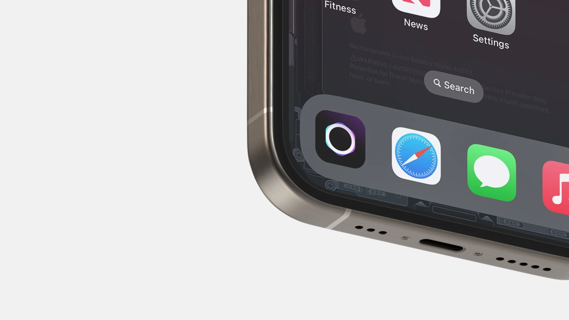
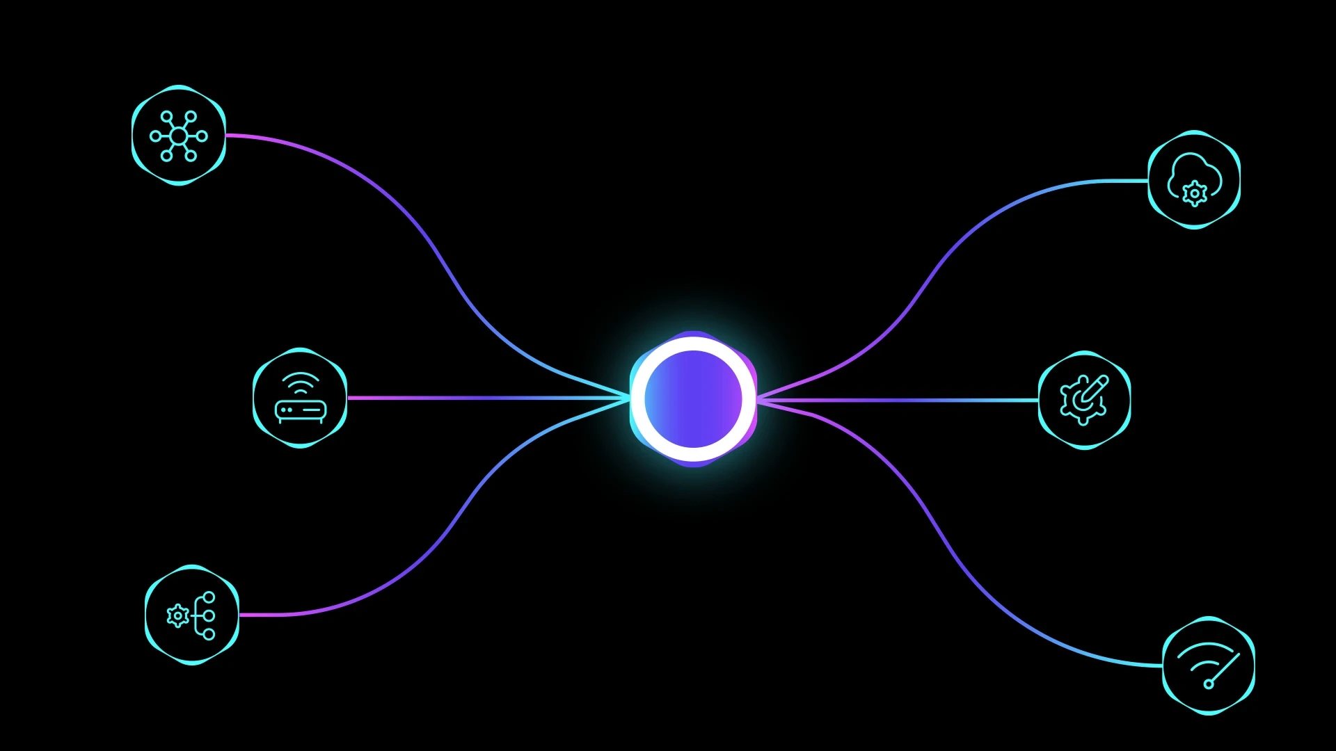
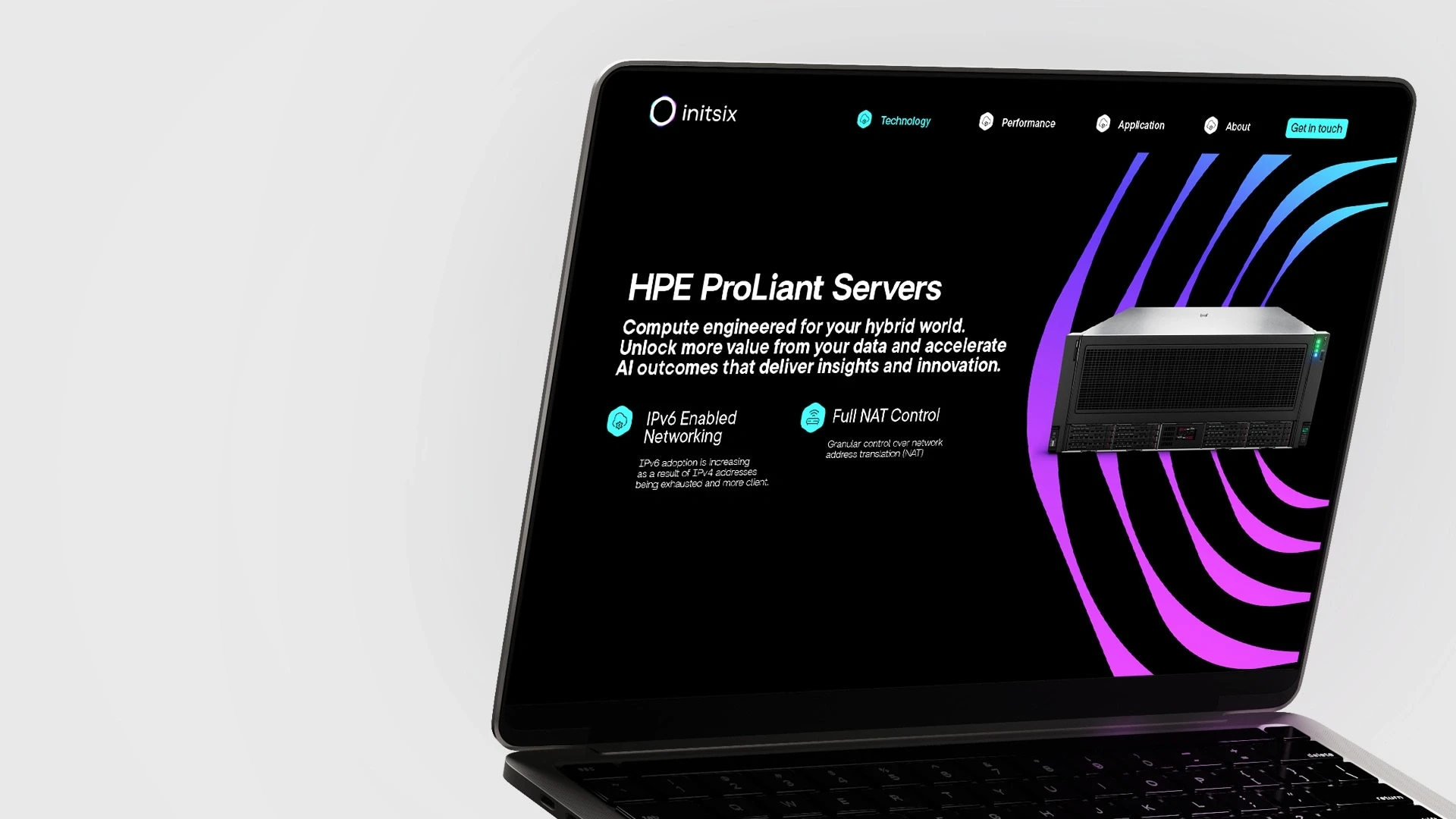
We approached it as system thinkers, designing not just a logo but a modular identity that scales like the technology itself open, agile, and precise. Every decision, from typography to motion, mirrors Initsix core values: scalability, reliability, and innovation. The result is a visual language that bridges engineering with elegance technical, timeless, minimal, and expressive a brand built to move at the speed of the future.
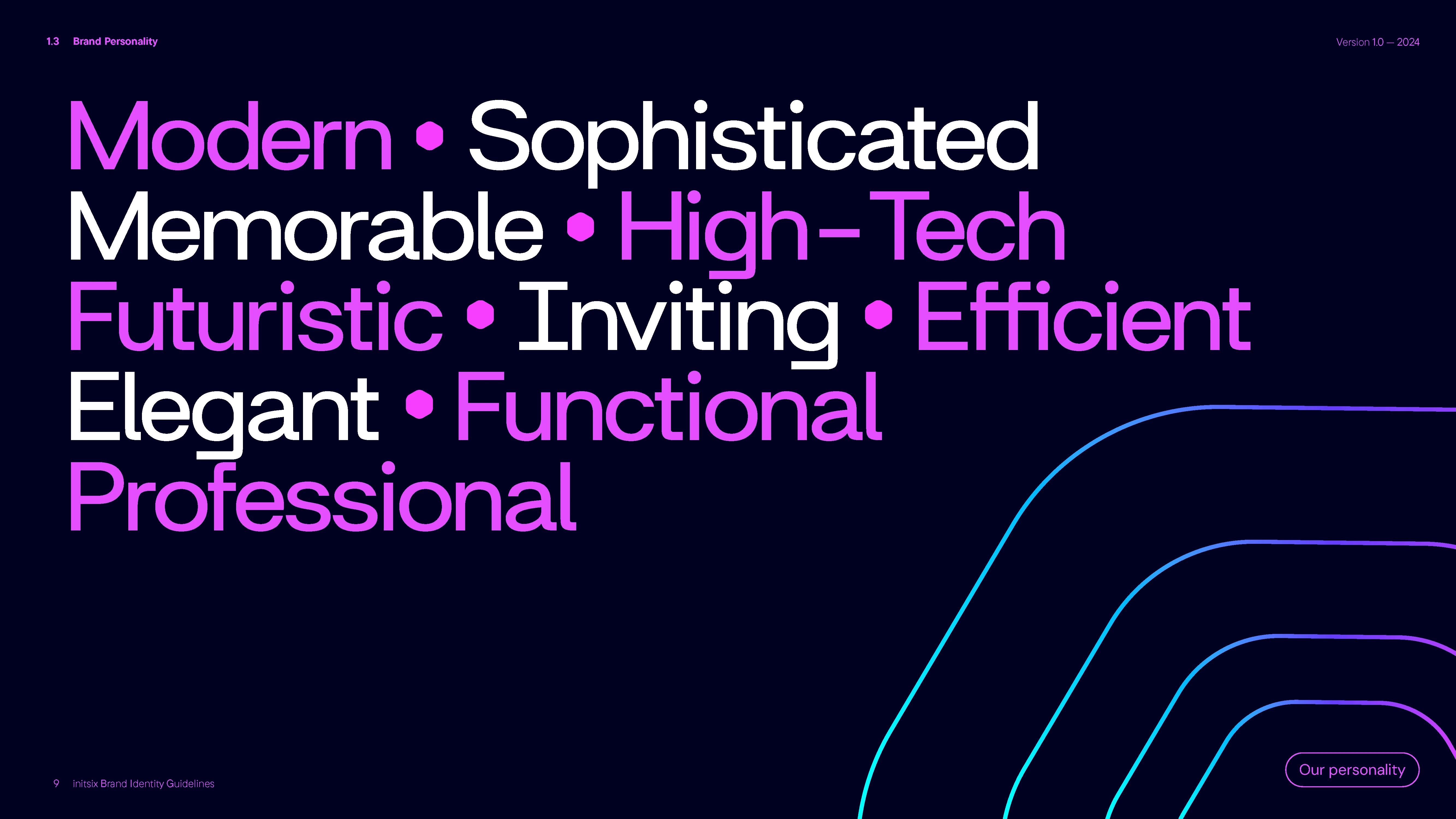
Initsix operates at the intersection of engineering precision and real-world application. The challenge was to humanize high-performance technology without diluting its sophistication. We focused on crafting a visual language that feels futuristic yet approachable, technical yet elegant a brand that speaks fluently to both engineers and decision-makers. We drew inspiration from the modular nature of Initsix’s systems. The grid, color palette, and typography all echo the structure of scalable networks flexible components working seamlessly together. The result is a living brand system: bold enough for enterprise, nimble enough for innovation. At its heart, the identity communicates confidence without arrogance, modernity without excess, and innovation with purpose.

