HyperActive

HyperActive

Designing

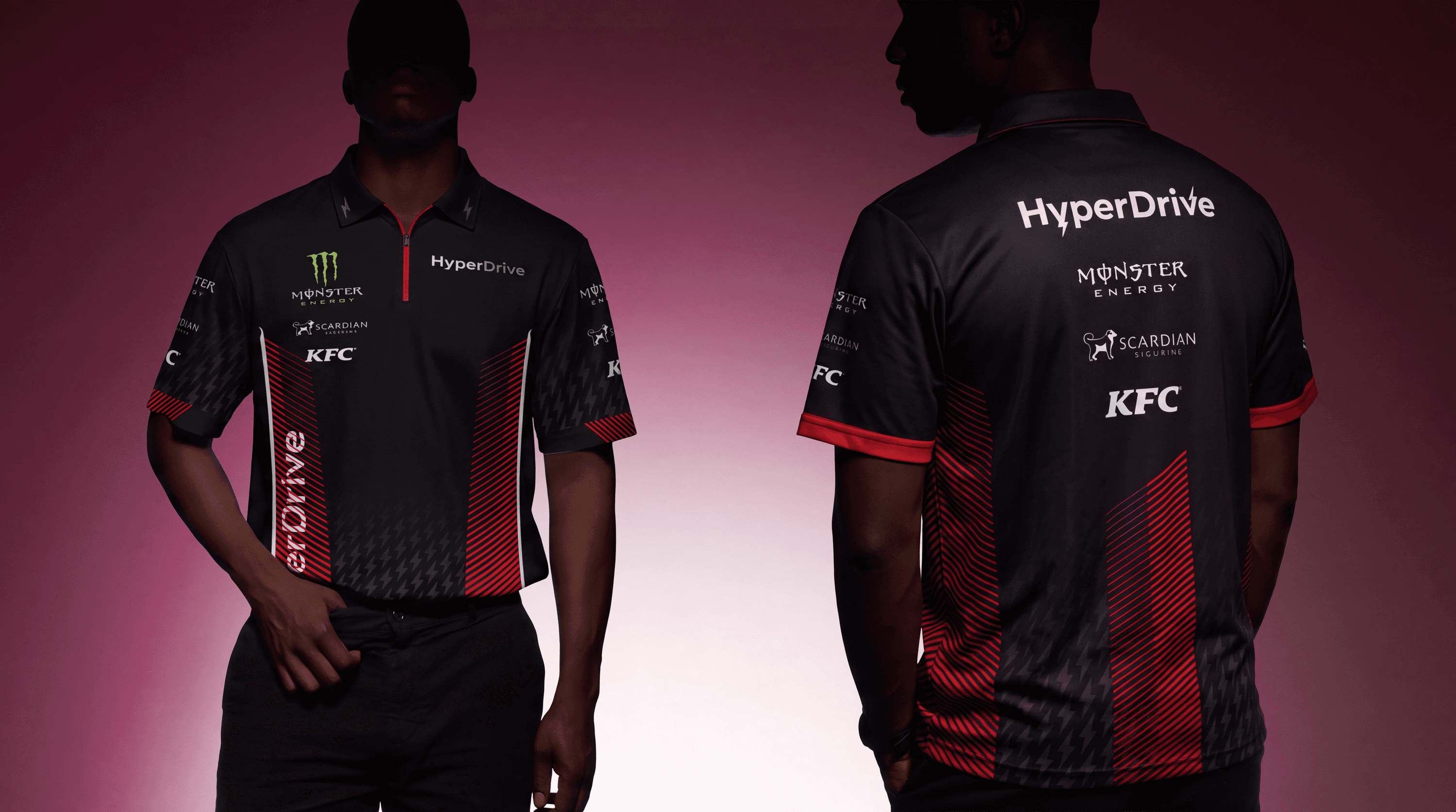
This wasn’t just about a new color palette, logo standards, or typography guidelines it was about establishing a new creative ecosystem custom-built for a new era of digital fandom. From a suite of screen-friendly gradients to an in-depth library of iterative digital display ads, we gave HyperActive all the tools it needs to stand out.

Industry

Real Estate

Scope of work

/

Brand Identity

/

Strategy

/

Animation

/

Creative Direction

/

Art Direction

/

Web design

/

Print

/

Copywriting

/

Content Creation

/

Motion Systems

Timeline

3 weeks

Designing

This wasn’t just about a new color palette, logo standards, or typography guidelines it was about establishing a new creative ecosystem custom-built for a new era of digital fandom. From a suite of screen-friendly gradients to an in-depth library of iterative digital display ads, we gave HyperActive all the tools it needs to stand out.

Industry

Real Estate

Scope of work

/

Brand Identity

/

Strategy

/

Animation

/

Creative Direction

/

Art Direction

/

Web design

/

Print

/

Copywriting

/

Content Creation

/

Motion Systems

Timeline

3 weeks

The project

The project

Building off the DNA of the HyperActive masterbrand, we worked for over half a year with HyperActive to develop a robust style guide and flexible visual identity designed to help HyperActive change the game in entertainment arena.

In our design phase, we built the HyperActive identity into a high-end, hyper-modern system. After designing the brand mark, we broke it into the geometric shapes that form the basis for the brand’s graphic language. Each piece can be reassembled into an infinite array of possibilities, in 2D or 3D space, forming an ever-expanding design system that welcomes creative expression.

Developing a dynamic, digital-first identity for a new generation of diverse, inclusive, cord-cutting enterteinment fans. Hyperactive typographic logo is loud. With an up-to-date exciting personality, with a hint of ruggedness. The typography is energised with the recharge icon on both words representing highs and lows of the emotion itself. The icon starts with the low and at the end of the name the energy gets higher, forming an elegant and timeless logo. The fresh HyperActive color palette uses gradients instead of single colors, allowing it to express the mood and tone of content rather than identify a single, rigid genre. The resulting system, compiled in a comprehensive style guide, allows the brand to further flex across mood and tone while always remaining clean, dynamic, and surprising.

WONDER®

Tell us what you're launching.

By submitting, you agree to our Terms and Privacy Policy.

© 2026 WONDER® Studio

Let’s talk.

WONDER®

Tell us what you're launching.

By submitting, you agree to our Terms and Privacy Policy.

Let’s talk.

WONDER®

Tell us what you're launching.

By submitting, you agree to our Terms and Privacy Policy.

© 2026 WONDER® Studio

Let’s talk.