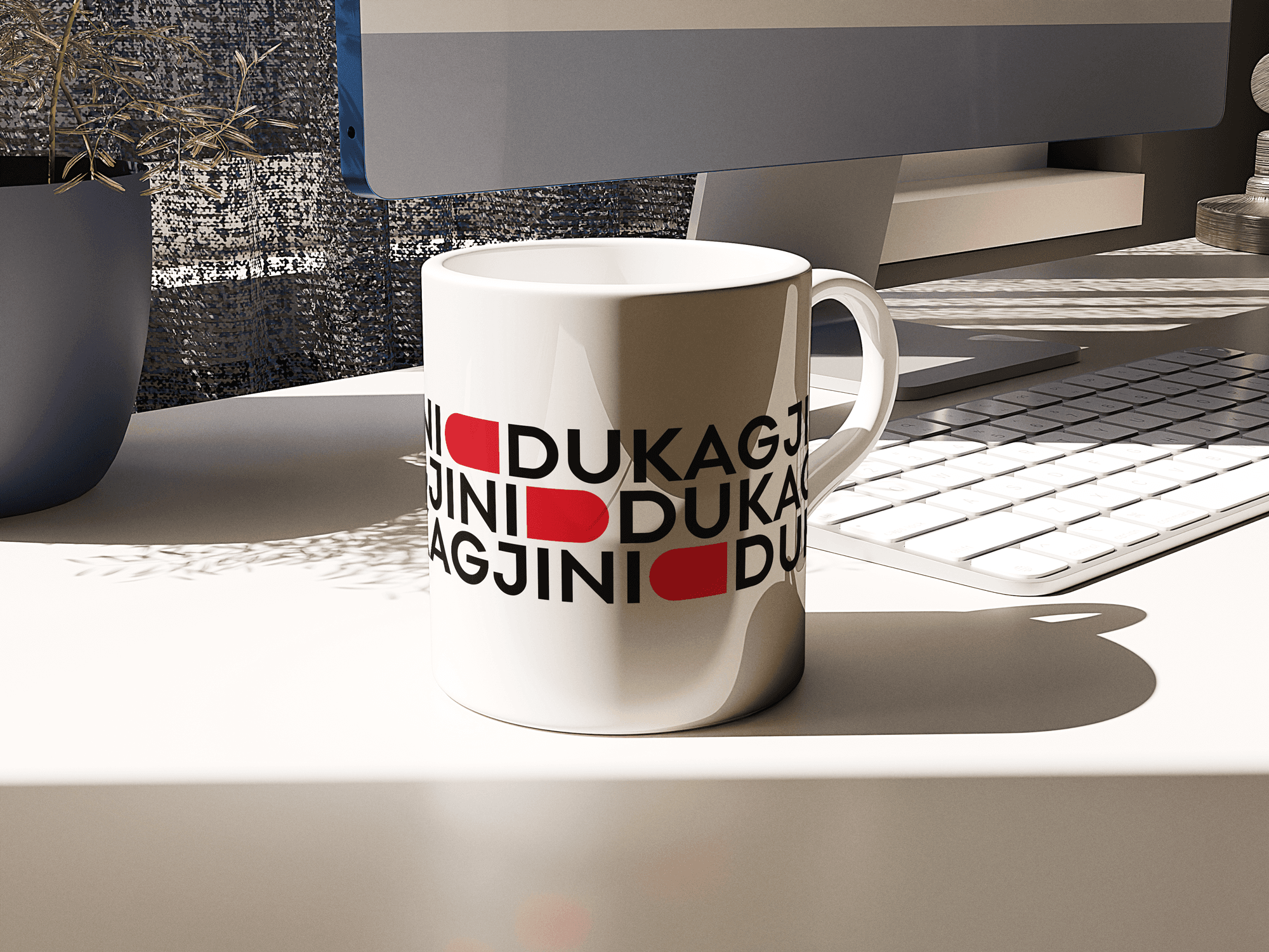
The new branding by Wonder refines the visual identity and expands it to a customized kit of parts that gives Dukagjini the flexibility to function consistently in a variety of environments. The Wonder team collaborated closely on the brand identity with Dukagjini leadership. The exuberant use of colorful graphics and patterns captures the brand attributes of fun, action, play, celebration, and joy. The geometric shapes of the identity are inspired by their only product. A closed book, which opens limitless graphic and creative possibilities.

rinu

rinu

rinu

rinu

rinu

rinu

rinu

rinu

rinu

rinu
rinu

rinu

rinu

rinu
The refreshed identity centers on the bright red letter D the iconic mark with scalloped edges that holds the bookstore name. The updated logo simplifies the D to its clean, simple geometry as the basis for an expanded visual language. The graphic elements can be combined into patterns and used to build emoji-like illustrations. The age-appropriate approach transitions from cute illustrations for babies to more “grown up” use of patterns for older kids.

